Hot spots elements consist of one or more pairs of hot spot elements and hot popup elements. A hot popup is shown when the <Event> of its associated hot spot is triggered.
To insert a hot spots element, use Interactions > Hot Spots. Hot spots can be inserted in their default design, for full customization, or as an interactive set.
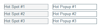
Usually, hot spots and hot popups go in pairs. To add such a pair, use Hot Spots > Add Hot Spot Pair. However, each “pair” can have any number of hot spots or hot popups.
To add a hot spot to an existing pair, select an element of the pair and use Hot Spots > Add Hot Spot to Pair. To add a hot popup to an existing pair, select an element of the pair and use Hot Spots > Add Hot Popup to Pair.
|
Behavior |
||
| Exclusive Popups | Checkbox | When on, only one hot popup of this activity can be active at a time. |
| Play Mode | Select | every time – Hot popups are reset to their initial state every time the document is visited. first time – Hot popups remain in their last shown state when the document is revisited. Only relevant when the document is set to persist activities. |
| Hide Mode | Select | effect – Use an effect (if defined) when hiding hot popups. plain – Hide hot popups without any effects. |
|
Style Rules |
||
| Visited Style | Style Rule | Used for a hot spot once its corresponding hot popup has been revealed. |
| Active Style | Style Rule | Used for a hot spot while it’s active. |
A hot spot is a generic element. To remove a hot spot, simply select and remove it using Design > Remove, or the Delete key.
|
Behavior |
||
| Event | Select | mouse over – The hot popup is shown when the mouse is over the hot spot, and hidden when it leaves. click – The hot popup is shown/hidden when the hot spot is pressed. timer – The hot popup is shown/hidden on a timer, according to <Timer Show Interval> and <Timer Hide Interval>. |
| Toggle | Checkbox | When on, the hot popup is shown/hidden each time the defined <Event> is triggered. |
| Hide All Popups | Checkbox | When on, hides all other popups as it’s triggered. |
| Hide Spot on Event | Checkbox | When on, hides the hot spot after being triggered for the first time. |
| Timer Show Interval | Unit | When <Event> is timer, the interval before revealing the hot popup. |
| Timer Hide Interval | Unit | When <Event> is timer, the interval before hiding the hot popup, after revealing it. |
| Spot Index | Number | The index of the hot spot, linking it to one or more corresponding hot popups which share the same index. |
| Opacity | Number | The opacity level (0–100) of the hot spot. Does not affect the appearance at design-time. |
|
Style Rules |
||
| Mouse Over Style | Style Rule | Used when the mouse is over the hot spot. |
| Visited Style | Style Rule | Used once the corresponding hot popup has been revealed. |
| Active Style | Style Rule | Used while the hot spot is active. |
A hot popup is a generic element, available for edit when the hot spot associated with it is selected. To remove a hot popup, simply select and remove it using Design > Remove, or the Delete key.
|
Behavior |
||
| Hide Event | Select | The event upon which to hide the hot popup, in addition to the behavior implied by any corresponding hot spot’s <Event>. none – No hiding. click – Hide the hot popup when it is clicked. mouse enter – Hide the hot popup when the mouse goes over it. mouse leave – Hide the hot popup when the mouse goes out of it. |
| Initial State | Select | The starting state of the hot popup, either hidden or visible. |
| Popup Index | Number | The index of the hot popup, linking it to one or more corresponding hot spots which share the same index. |
|
Navigation |
||
| Lock Next Navigation | Checkbox | When on, prevents from navigating to the next page before the hot popup is revealed. |
|
Style Rules |
||
| Mouse Over Style | Style Rule | Used when the mouse is over the hot popup. |
The hot popup close button gives a formal and clear way of closing the hot popup. To add a hot popup close button to a hot popup, use Hot Popup > Add Hot Popup Close Button. To remove it, simply select and remove it using Design > Remove, or the Delete key.