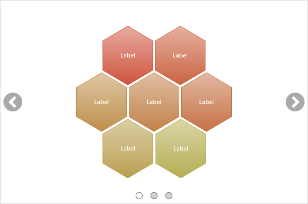
Carousels allow displaying a series of slides, each containing rich content, which can be cycled through either automatically or manually by the learner. Each slide is represented by the carousel slide sub-element.
Navigating between slides can be done using either the navigation arrows or the quick navigation bar. When designing the document, the same navigation arrows and quick navigation bar can be used to navigate between slides, in order to edit them. If the navigation arrows or quick navigation bar are hidden using their respective properties, they will still be displayed in the editor while the mouse is over the carousel element. Alternative, the elements tree can be used to activate a specific slide.
To insert a carousel element, use Basic Elements > Carousel.
|
Carousel Slide |
||
| Slide Index | Number | The ordinal index of the currently active slide, in the order of slides in the carousel. |
| Narration | Media | An audio file containing narration to be played when the slide is revealed. |
| Narration Volume | Number | Determines the volume of the narration, with 100 being full volume, and 0 being muted. |
|
Behavior |
||
| Loop | Checkbox | When on, the slides are cyclical and navigating past the last slide returns to the first, and vice versa. |
| Play Mode | Select | every time – The state of the carousel is reset to its initial state every time the document is visited. first time – The carousel remains in its last shown state when the document is revisited. Only relevant when the document is set to persist activities. |
|
Animation |
||
| Enabled | Checkbox | When on, a transition animation is used when navigating between slides. |
| Type | Select | The animation style to use when transitioning between slides. |
| Duration | Unit | The duration of the transition between slides. |
|
Slideshow |
||
| Enabled | Checkbox | When on, the slides are cycled automatically, without requiring interaction from the learner. |
| Delay | Unit | The time to wait after revealing a slide, before navigating to the next slide. |
| Pause on Hover | Checkbox | When on, the slideshow is paused while the mouse is over the carousel, to allow the learner to interact with the carousel without interference. |
|
Navigation Arrows |
||
| Enabled | Checkbox | When on, forward and backward arrows are displayed over the carousel, allowing the learner to navigate between the slides. |
| Horizontal Offset | Unit | The horizontal offset of the arrows from their default position. |
| Vertical Offset | Unit | The vertical offset of the arrows from their default position. |
| Previous Button | Media | Used for the previous arrow button in its normal state. |
| Previous Button Over | Media | Used for the previous arrow button while the mouse is over it. |
| Next Button | Media | Used for the next arrow button in its normal state. |
| Next Button Over | Media | Used for the next arrow button while the mouse is over it. |
|
Quick Navigation |
||
| Enabled | Checkbox | When on, quick navigation buttons are displayed for each slide in the carousel, highlighting the currently active slide and allowing to navigate directly to a specific slide. |
| Offset | Unit | The horizontal offset of the quick navigation buttons from their default position. |
| Image | Media | Used for the quick navigation button in its normal state. |
| Over Image | Media | Used for the quick navigation button, while the mouse is over it. |
| Active Image | Media | Used for the quick navigation button of the actively showing slide. |
| Visited Image | Media | Used for the quick navigation button of a slide that’s already been visited. |
| Visited Over Image | Media | Used for the quick navigation button of a slide that’s already been visited, while the mouse is over it. |
| Indicate Visited | Checkbox | When on, quick navigation buttons show a different image once a slide has been visited. |
|
Navigation |
||
| Lock Next Navigation | Checkbox | When on, prevents from navigating to the next page before all carousel slides have been shown. |
A carousel slide is a single frame of the carousel, which can contain rich content and any other Composica elements. Editing the content of the carousel element will edit the currently active slide. To add an additional slide to the carousel, use Carousel > Add Slide. To change the placement of the active slide in the carousel order, use Carousel > Move Back and Carousel > Move Forward. Alternatively, slides can also be rearranged by dragging them around in the elements tree. To remove the active slide from the carousel, use Carousel > Remove Slide.
