One-level menus show a traversable menu of one level of the project’s outline. The contents of the menu at design-time are only for design purposes, while the menu is only populated with its real contents at run-time.
One-level menu elements consist of one or more: menu chapter elements, menu page elements, derived chapter elements, derived page elements, menu block elements, menu container elements, current marker elements, started marker elements, and done marker elements.
To insert a one-level menu element, use Basic Elements > Navigation > One-Level Menu. Alternatively, to insert one of the preset menu sets for a richer out-of-the-box experience, use Basic Elements > Menu Set.
|
Location |
||
| Menu Root | Select | Defines which document will be considered as the root of the menu. Any documents higher than the menu root will not be shown as part of the menu. project – The root of the project. current location – The current document. parent location – The parent of the current document. mixed – The current document if it’s a chapter, or the parent document otherwise. custom – A custom document, specified by <Custom Root>. |
| Custom Root | Resource | The document to consider as the root of the menu. |
|
Initial Appearance |
||
| Layout | Select | columns – Shows a column for each branch in the root level, with its derived documents underneath it. rows – Shows a row for each branch in the root level, with its derived documents side-by-side. bars – Shows a list of all the documents. pop menu – Shows a list of all the documents in the root level, with each branch opening a list of derived documents. drop down – Shows a column for each branch in the root level, with its derived documents dropping down from it. |
| Start State | Select | collapsed – Initiates the tree with all chapters in collapsed state. expanded – Initiates the tree with all chapters in expanded state. |
| Show | Select | all – Show any type of documents. pages – Show only page documents. chapters – Show only chapter documents. |
| Auto Expand | Select | Automatically expand the menu to show the current page. |
| Auto Scroll | Checkbox | When on, automatically scrolls the menu to show the current page. |
| Show Empty Chapters | Checkbox | When off, empty chapters are hidden from the menu. |
| Hide Unvisited | Checkbox | When on, documents which have not yet been visited are hidden from the menu. |
| Wrap Titles | Checkbox | When on, document titles which exceed the available width wrap to a new line. |
|
Behavior |
||
| Collapsible | Checkbox | When on, chapters can be collapsed to hide the documents inside them. |
| Toggle Sibling | Checkbox | When on, expanding a chapter collapses all its sibling chapters. |
| Disable Navigation | Select | yes – The menu is for display purposes only, and cannot be used for navigation. no – The menu can be used for navigation. only to unvisited – The menu can be used for navigation only for pages that have already been visited. |
|
Markers |
||
| Current Marker | Checkbox | Defines whether the current marker is shown. |
| Done Marker | Checkbox | Defines whether the done marker is shown. |
| Started Marker | Checkbox | Defines whether the started marker is shown. |
| Mark Current Chapter | Select | all parents – Mark all parents of the current page as the current chapter. highest parent – Mark only the highest parent of the current page as the current chapter. nearest parent – Mark only the nearest parent of the current page as the current chapter. |
|
Style Rules |
||
| Mouse Over Sub-Chapter | Style Rule | Used for derived chapter elements when the mouse is over them. |
| Mouse Over Sub-Page | Style Rule | Used for derived page elements when the mouse is over them. |
| Mouse Over Chapter Style | Style Rule | Used for menu chapter elements when the mouse is over them. |
| Mouse Over Page Style | Style Rule | Used for menu page elements when the mouse is over them. |
| Current Chapter Style | Style Rule | Used for chapter elements when they are the current chapter. |
| Current Style | Style Rule | Used for page elements when they are the current page. |
| Done Style | Style Rule | Used for page elements when the page is done. |
Each chapter of the root level’s outline is represented by a menu chapter element. Customizing the visual appearance of one menu chapter element will alter the visual appearance of all menu chapter elements throughout the menu.
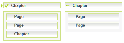
When <Collapsible> is on, and the chapter contains other documents, pressing the menu chapter element collapses or expands (hides or shows, accordingly) the documents underneath the chapter. Otherwise, pressing the menu chapter element can be used to navigate to the chapter, if permitted according to <Disable Navigation>.
Each page of the root level’s outline is represented by a menu page element. Customizing the visual appearance of one menu page element will alter the visual appearance of all menu page elements throughout the menu.
Pressing a menu page element can be used for navigating to the page, if permitted according to <Disable Navigation>.
Each chapter underneath the root level is represented by a derived chapter element. Customizing the visual appearance of one derived chapter element will alter the visual appearance of all derived chapter elements throughout the menu.
Pressing a derived chapter element can be used for navigating to the chapter, if permitted according to <Disable Navigation>.
Each page underneath the root level is represented by a derived page element. Customizing the visual appearance of one derived page element will alter the visual appearance of all derived page elements throughout the menu.
Pressing a derived page element can be used for navigating to the page, if permitted according to <Disable Navigation>.
Menu blocks elements are used for each branch underneath the root level.
Menu container elements are used to hold documents underneath each chapter inside each menu block.
The current marker element is a generic element, which is used to mark the current document in the menu. Current markers are only shown when <Current Marker> is on.
The started marker element is a generic element, which is used to mark a chapter which has been started but not completed. Started markers are only shown when <Started Marker> is on.
The done marker element is a generic element, which is used to mark which of the documents in the menu are done. Done markers are only shown when <Done Marker> is on.