Responsive design is an approach which allows creating one course which is compatible with any target device or platform, be it a desktop computer, a tablet or a smartphone. Through the use of responsive authoring, Composica enables the author to easily create and maintain a fully responsive course, without having to duplicate content or create several courses for different platforms. A responsive course allows the author to adjust and adapt the layout of the course for each screen size, in a highly flexible manner, so that the learner can get the optimal experience on their device of choice.
Creating a responsive project
To create a responsive project, simply start a new project, and choose Responsive as the target device. A responsive project is created by default at the optimal size to most easily be adapted to all platforms, but this can be further customized using run-time properties. The built-in system styles are responsive-aware, and adapted to work optimally with every device. Once the project is created, it is filled in with content, just like a normal project, and then specific adjustments are made to adapt the layout in each specific mode.
Alternatively, an existing project can be converted into a responsive course using the Responsive toggle button in the Project ribbon. This allows maintaining the content of an existing course and making the necessary adjustments to adapt it to all devices. Note that although converting a course to responsive makes some automatic adjustments to ensure the content fits in all modes, manual adjustments will need to be made to each document to provide an optimal experience to learners in all devices. It is highly recommended to create new projects as responsive, rather than creating a non-responsive course and converting it to responsive.
A responsive project can also be converted into a non-responsive one, using the Responsive toggle button in the Project ribbon. This maintains the desktop layout of the course, while discarding any adjustments made specifically for other devices. When converting a project between responsive and non-responsive, a back-up of the project is automatically made and can be found in the Archived projects tree.
At the top of the editing area, the responsive toolbar provides several switches to change between the various available responsive modes. Each switch indicates a different target device and orientation. Changing between modes adjusts the size of the editing area to match the target device, and shows how the content fits in that particular mode, allowing to make adjustments to the layout, style and appearance between modes. The recommended best practice is to create and design the content in the desktop mode first, and then make necessary adjustments to the layout in other modes as necessary.
By default, a responsive project is sized so that its base design fits both on desktop devices and on tablets in their landscape orientation, so that the design is more consistent and less adjustments are necessary. It is, however, possible to change the course size and enable or disable any of the available modes, using the run-time properties dialog.
Mode inheritance
Any layout or style changes made in a specific mode is “inherited” by all smaller modes, with desktop mode being the base for all other modes. The responsive toolbar illustrates the order of the inheritance chain. Once a change has been made to a specific property, it is no longer inherited from its ancestor mode. The specifity marker in the properties grid shows which properties have been overridden in the currently selected mode, and allows clearing the override and restoring inheritance for the specific property. Furthermore, the reponsive action menu provides options to clear all overrides for an element, to fully restore it to its inherited layout.
Auto-adjustment
By default, automatic adjustments are made to most elements to ensure they fit in smaller modes without exceeding the boundaries of the document. However, these adjustment are very rudimentary and in most cases manual adjustments will need to made to provide an optimal layout for the learner.
As long as no overrides are made in a specific mode, the element will continue to auto-adjust according to any layout changes made in its ancestor mode, and once any override or change is made to the element, it is “fixed” and no longer inherits these changes. Therefore, it is recommended to design the course using a top-down approach, starting from desktop and making adjustments to smaller modes in the order of the inheritance chain. At any point an element can be reset to its auto-adjusted position by clearing all of its overridden properties in the properties grid or using the reponsive action menu.
Auto-adjustment can be manually disabled or enabled for specific elements using the <Auto Adjust> property.
Excluded elements
Elements can be excluded from participating in the current mode, hiding them from the learner when the course is viewed at the specific device and orientation. This allows omitting unnecessary elements from smaller modes which have less space, and even showing different content in different devices. Elements can be excluded and restored using the reponsive action menu, and elements which are excluded in the current mode can be found in the Excluded Elements section of the elements tree.
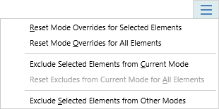
The responsive drop-down menu, available at the right edge of the responsive toolbar, provides several additional actions which apply to the currently active mode:
- Reset Mode Overrides for Selected Elements – Resets any overridden properties for the selected element(s) back to their inherited or auto-adjusted values.
- Reset Mode Overrides for All Elements – Resets any overridden properties for the all elements in the document back to their inherited or auto-adjusted values.
- Exclude Selected Elements from Current Mode – Excludes or restores the selected element(s) from participating in the current mode.
- Reset Excludes from Current Mode for All Elements – Restores all elements in the document from being excluded in the current mode..
- Exclude Selected Elements from Other Modes – Excludes the selected element(s) from all modes except the current mode, making it available only in the current mode.