The project glossary provides a centralized location to maintain a list of glossary terms, or a dictionary, along with detailed definitions of each term. The glossary can be made available to the learner in its entirety, allowing the learning to browse through all terms or search for a specific term, using a glossary button. Alternatively, single term entries can be displayed throughout the course, in their relevant context, using the glossary term element. The style of the glossary can be customized to match the overall style and color scheme of the course, and various settings related to the glossary can be adjusted to fit the specific needs of the project.
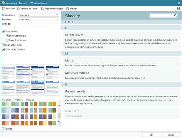
The glossary manager provides control over the glossary, including adding, editing and removing terms, as well as customizing its appearance and behavior. The glossary manager is available via Project > Glossary.
The glossary dialog is comprised of two main parts. The left pane contains various settings and controls to adjust the appearance and behavior of the glossary. The right pane displays an editable live preview of the glossary, as it would appear to the learner. The preview pane allows to add, edit and remove entries from the glossary.
To add a new term, simply click on the New Term placeholder in the preview pane, to start editing the new term’s title. Similarly, to edit the term’s definition, simply click on the Term Definition placeholder. A new term placeholder is always available as the last term in the preview pane. Alternatively, a new term can be added by pressing the Add Term ribbon button.
The term title and term definition can be edited at any time within the preview pane, simply by clicking on the relevant field. The term definition also allows for basic rich-text editing, such as bold, italics, or lists, by simply selecting a section of the definition text, and using the floating rich-text editor which appears next to the selection.
When hovering the mouse cursor over a glossary term in the preview pane, a remove button will appear in the top-right corner allowing to remove it. To remove all terms and clear the glossary, use the Remove all Terms ribbon button.
The left pane contains various settings which control the behavior and appearance of the glossary. The following settings can be adjusted:
- Heading Font – the font to use for all heading text in the glossary, including the main header, term titles, letter captions, etc. By default, the project’s primary font is used.
- Body Font – the font to use for all other text in the glossary, including the term definitions. By default, the project’s primary font is used.
- Text Size – dragging the slider allows to scale all text in the glossary larger or smaller.
-
Show Header – determines whether the entire header section of the glossary is displayed, including the header title, the search field, and the print button. The text of the header title can be edited directly in the preview pane, similarly to glossary terms, by clicking on it.
- Show Search Field – determines whether the search field is displayed. The search field allows the learner to search for one or more words in the term titles or definitions.
- Show Print Button – determines whether the print button is displayed. The print button allows the learner to print the entire glossary.
- Show Letter Index – determines whether the letter index is displayed. The letter index shows at the top of the glossary, and displays a link for each first letter of glossary terms, allowing for quick navigation within the glossary.
- Show Letter Captions – determines whether letter captions are displayed. Letter captions are displayed between glossary terms, for each first letter of the terms.
A style selector is available below the settings, showing thumbnails of different preset styles which can be applied to the glossary. To apply a different style, simply click on one of the thumbnails, and the style will immediately be applied in the preview pane. Different styles can be applied at any time, without affecting the content of the glossary.
Below the style selector, a colorizer allows for choosing between different color schemes and variations, to fully customize the appearance of the glossary. By default, the project’s main color scheme is used. Similarly to the style, the color scheme is immediately displayed in the preview pane and can be changed at any time, without affecting the glossary’s content.
Glossary terms can be imported from another project, using the Import from Project ribbon button. The Import Glossary Terms dialog allows to select a project, and choose one or more glossary terms to import from that project. A search field is available, which allows to search for a specific term or definition within the selected project.
For more advanced usage of the glossary, a template project can be created to serve as a central repository, from which common terms can be imported to other projects as necessary.
Using the Preview ribbon button, a popup can be opened displaying a preview of the glossary in its current state, exactly as it would appear to the learner when opened from the course. The preview popup is fully interactive, including the search field and print buttons, if they’re set to be displayed.